
Centralizing
Facilities Management
from Bosch
Design of a unified system to increase operational efficiency
Visão geral
As an interface designer on Bosch's DiOS project, my task was to unify disparate and inefficient management systems into a centralized web platform.
The result was a user-friendly interface with an interactive map that facilitated management of the entire campus, streamlining operational processes. Six workflows were redesigned, with over 30 screens.
Product
Web system
My role
UI/UX Designer
Time
2 UI/UX Designers, 1 PO, 3 Devs and 1 UX Supervisor
Workflow
Discovery
Design
Delivery
Stakeholders and User interviews
Desk research
User flows
Benchmarking
Lo-fi wireframes
Prototypes & usability tests
Technical constraints
Concepts & UI design
Handoff
Discovery
The process began with a series of in-depth interviews with Bosch stakeholders and potential users of the system to understand their needs and expectations regarding the platform. During these conversations, the main insight that emerged was the need to develop an extremely intuitive and clear solution, since the system would be used by people without technical knowledge. This was crucial, as it indicated that simplicity and ease of use would be fundamental to the tool's success.
With this understanding in mind, we conducted a detailed benchmarking study, studying market solutions, their design approaches, and best practices adopted by companies across different sectors. From this analysis, it became clear that the solution needed to be highly visual, with graphical and interactive interfaces that facilitated user interaction with the platform, without being overwhelming or confusing. This guided the interface design, ensuring it was accessible and efficient for all types of users, regardless of their level of technical knowledge.
Operational inefficiency
Without an accurate view of consumption in real time, it was impossible to optimize energy use, which generated waste.
Objective
Develop a digital solution that unifies and simplifies management for all levels and user profiles, from managers to employees.
System fragmentation
The control of air conditioning, lighting, sensors and cameras was carried out on different platforms, without an integrated view.
Ineficiência operacional
The maintenance team struggled to identify problems quickly, and management was reactive rather than proactive.
Definition of ideation
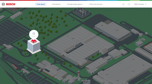
The concept of using an interactive map as a central navigation element emerged as the most effective alternative to meet the expectations of intuitiveness identified in the research. This resource would offer users a simple and straightforward overview of the campus, facilitating understanding of the system and quick access to key features.
Based on this premise, we structured flowcharts that represented the most relevant tasks for each user profile. Examples include scenarios such as "manager adjusts floor temperature" or "employee reports a burned-out light." These detailed flows not only helped validate that navigation would be clear and objective, but were also crucial for defining development priorities. This way, we were able to align practical day-to-day needs with the solution's value proposition, ensuring that critical functionality was delivered first, always focusing on the user experience.

Map design
The Isometric Map Challenge: The main UI challenge was developing the campus map in an isometric style. This element could not only be functional, offering interaction and control features, but also needed to be visually clear and easily recognizable by any employee, regardless of their level of familiarity with the technology. The representation had to immediately convey the physical structure of the space, allowing the user to identify sectors, buildings, and floors naturally. This balance between usability and visual fidelity was key to ensuring that the map became the core of the platform experience.

1
The initial step was to identify and catalog all essential buildings and structures that would need to be represented in the system.

3
The first step was to identify all relevant buildings and structures.

2
Based on the plan, we vectorized the silhouette of each recognizable building and structure.

4
Using Google Maps and photographs of the site, it was possible to identify and extract the main visual characteristics of the area.

5
Including real-time climate control also proved crucial for employees. Weather conditions often hampered technicians' work, requiring them to travel and even climb buildings to perform repairs. By integrating this information directly into the system, it was possible to reduce the need for outings in unfavorable situations, improving team safety and efficiency. This functionality made the maintenance process much more agile and practical, allowing for remote and more accurate decision-making.


Design System
To ensure visual consistency across all system workflows and dashboards, we developed a comprehensive style guide , which served as a central reference for the team. This guide defined standards for color, typography, spacing, information hierarchy, and best practices for using visual elements, ensuring a consistent user experience.
Additionally, we created an initial repository of reusable components —such as buttons, cards, icons, form fields, and other basic interface elements. This collection allowed for greater development agility and facilitated project maintenance, as any adjustments to one component were automatically reflected throughout the system. This approach not only streamlined the work of the design and development team but also laid a solid foundation for the future evolution of the platform, moving closer to a scalable design system.

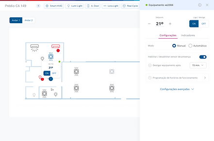
The Solution: A Smart Control Panel
The final solution resulted in a unified web platform capable of providing a complete and integrated (360º) view of the entire Bosch campus. The system was built on two main pillars, which complement each other to meet both day-to-day operational needs and strategic management demands:
Interactive Map: This serves as the core navigation, allowing any user to visually explore the campus. Through it, users can click on specific buildings, floors, or rooms and immediately access the controls and equipment status of each location. This visual approach simplifies interaction, making the experience more intuitive for different user profiles.
Monitoring Dashboards: Designed specifically for managers and technical teams, these dashboards provide a clear, consolidated view of real-time energy consumption, as well as detailed status of all equipment. These dashboards allow you to quickly identify faults, track performance metrics, and inform data-driven decisions, promoting efficiency and reducing waste.
With these two pillars, the platform unifies control, increases operational transparency, and creates a digital environment that promotes both practicality in everyday use and strategic campus management.


Results
Despite not having access to post-launch metrics, the project was successfully delivered and received very positive feedback from the Bosch team during usability testing. Navigation through the map was highlighted as particularly intuitive and clear, achieving one of the project's main objectives. Furthermore, centralizing all information in a single location was recognized as a significant improvement in the management team's efficiency, facilitating decision-making and monitoring operations in a more agile and organized manner.
Learnings
This project reinforced for me the importance of transforming complex technical information into clear visual representations that are immediately understandable and functional for the end user.
The success of the isometric map demonstrated how a well-constructed visual metaphor can enhance usability and make digital products more intuitive, facilitating interaction even for users without technical experience. This experience reinforced my understanding that effective design goes beyond aesthetics, becoming a strategic tool for connecting technology and people.


